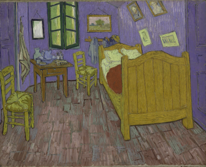
Scientists in Chicago have produced a visualisation of van Gogh’s Bedroom in Arles, showing what it would have looked like before its colours faded.
The artist painted three versions of this famous scene, using broadly the same colour scheme.
But time and light degradation have taken their toll on the pigments.
Using a variety of techniques, the researchers have digitally restored the light blue walls and door to their original lilac and purple, according to BBC.
The computer visualisation is part of a major new exhibition at the The Art Institute of Chicago, which brings together all three versions for only the second time since van Gogh produced them.
It is hoped visitors to the exhibition will get a deeper sense of the emotions the 19th Century artist was trying to convey in the works.
“Science is vital in identifying the pigments that have faded, but then there is a lot of interpretation that we rely on from conservators and art historians who really know the hand of the artist, and know how to dial that virtual knob more or less,” explained Dr Francesca Casadio, Mellon Senior Conservation Scientist at the Chicago institute.
“This is just a visualisation of what we think the faded colours looked like, but barring the invention of a time machine it will always still be an approximation.”
“He describes it in detail – that the furniture is yellow, the bedspread is red, and the walls are lilac and the doors purple. Well, today, the wall is light blue,” said Dr Casadio.
Taking a tiny flake of wall paint and examining it under the microscope, the team could see remnants of the original pigment. It is a carmine lake, or cochineal, pigment. Extracted from the bodies of certain insects, this pink pigment is vivid but fades rapidly over time.
“Of course, pink and blue makes purple,” Dr Casadio adds.
The team then set about investigating the rest of the scene, using X-ray techniques that allowed them to interrogate pigments at the atomic level, and so gauge their original “recipe”.
All this information went into the algorithms that make the final representation.
“And when you see the painting today in the visualised form, you get this sense of what the artist wanted – that the painting should convey a sense of repose, of calm. The colour combination should rest the mind, or rather the imagination. And once you have this purple restored, it’s also restoring the balance between the complementary colours – the yellow and the purple – and it’s really a very different mood to the painting.”
H.Z

